 Design
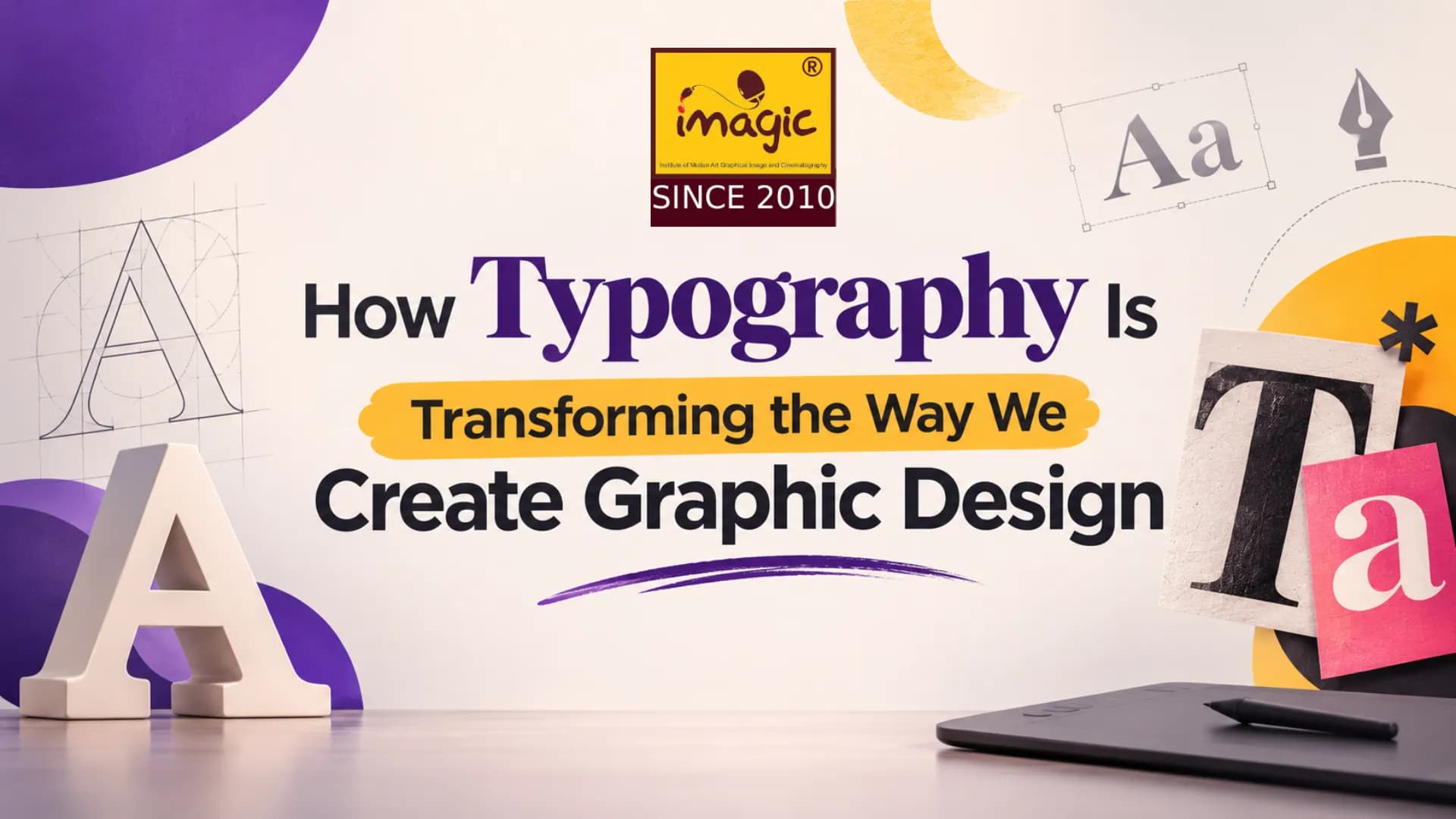
Typography is no longer just something you read—it is something you feel. From bold headlines and expressive letterforms to animated text and responsive fonts, typography is becoming one of the most powerful tools in modern visual communication. Typography has always played an important role in graphic design. Whether choosing a font for a logo or arranging text on a poster, every typographic decision affects how people understand and respond to a design.
However, typography is evolving beyond simply making information readable. Designers are using expressive fonts, creative layouts, text effects, and animated types to make visual communication more engaging. As we move into 2027, typography is taking center stage in branding, advertising, social media, website design, and digital marketing—turning text into a powerful creative element rather than just a supporting detail.
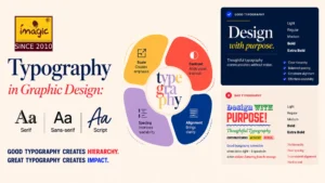
Types of Typography
Why Typography Matters
Typography is the art and technique of arranging text. It includes the choice of typeface, font size, spacing, alignment, colour, hierarchy, and overall visual treatment. Good typography does more than make content look attractive. It helps readers navigate information, understand priorities, and feel the intended mood of a brand. A playful handwritten font may feel friendly and informal, while a sharp geometric typeface can communicate confidence, technology, or modernity.
In visual communication, typography often works alongside colour, imagery, and layout. But when used boldly, type can become the design itself—turning a simple message into a striking visual statement.
How Typography Is Changing Modern Graphic Design
The current shift is moving away from overly uniform, “safe” typography toward more expressive and character-driven design. Brands and creators are using type to stand out in crowded digital spaces, where attention is limited and first impressions matter.
-
Bold & Oversized Typography
One of the most noticeable changes in modern graphic design is the growing use of oversized typography. Large, bold headlines are being used as central visual elements. Instead of supporting an image, the words themselves create impact, energy, and personality.
This approach works especially well for posters, campaign visuals, fashion branding, music promotions, and social-media graphics. Oversized types can make a message impossible to ignore.
-
Handmade and imperfect lettering
Hand-drawn letters, irregular strokes, and imperfect textures add a human touch to digital design. They can make a brand feel warm, personal, artistic, or authentic.This trend is popular because audiences often respond to visuals that feel less polished and more relatable. Handmade typography can bring emotion and character to packaging, posters, editorial layouts, and social content.
-
Kinetic Typography
Kinetic typography uses movement to bring words to life. Text may slide, fade, stretch, rotate, or change shape in videos, websites, apps, and digital advertisements. When used thoughtfully, motion can emphasise a message, guide attention, and create a more engaging experience. It is especially effective in short-form video, reels, presentations, and interactive web design.
-
Variable and Responsive Fonts
Variable fonts allow designers to adjust weight, width, style, and optical size within a single font file. This makes it easier to create flexible designs that remain consistent across different screens and devices.For brands, this means typography can adapt to a website, mobile app, advertisement, or digital interface while still maintaining a recognisable identity. Variable fonts are becoming an important part of modern brand systems.elements.envato+1
-
Experimental and Distorted Typography
Stretched, warped, layered, and asymmetric letterforms are appearing more often in creative branding and editorial design. These styles can communicate rebellion, creativity, energy, or a strong point of view. However, experimental typography needs careful handling. It should support the message rather than make it difficult to understand. The best designs use distortion purposefully, while keeping essential information readable.
-
The Return of the Creative Sherif Fonts in Typography
After years of minimal sans-serif fonts dominating digital designs, serif fonts are making a creative comeback. With their decorative strokes and elegant appearance, serif fonts add personality and sophistication to designs. They are widely used in fashion branding, magazine covers, luxury packaging, and modern advertisements.
Designers are also combining traditional serif fonts with contemporary layouts to create fresh and distinctive visual identities.
-
Typography a in Branding
Typography is a major part of brand identity. A font can communicate whether a brand is luxurious, playful, bold, trustworthy, futuristic, or traditional.
For example, a premium fashion label may use elegant serif type, while a youth-focused streetwear brand may choose bold, distorted, or experimental lettering. The goal is not simply to follow a trend, but to choose a type that matches the brand’s personality and audience.Consistency is equally important. When typography is used consistently across packaging, social media, websites, advertisements, and presentations, it helps people recognise and remember a brand more easily.
How to Use Typography Effectively
- Start with readability: choose clear fonts for body text and reserve experimental styles for headlines or accents.
- Create hierarchy: use size, weight, and spacing to show what readers should notice first.
- Limit font choices: two or three complementary typefaces are usually enough for a clean, professional design.
- Consider the platform: typography should remain legible on mobile screens, posters, websites, and social media.
- Match type to emotion: select letterforms that support the mood and message of the design.
- Use white space: spacing around text improves clarity and gives typography room to stand out.
Final Thoughts
Typography is no longer just about making text readable. It’s about making it felt. The designers and brands who understand how letters shape mood, meaning and memory will be the ones whose messages connect.
However, following trends alone is not enough. A good designer understands when to experiment, when to maintain simplicity, and how to choose typography that supports the purpose of a design.
Want to Turn Your Creativity into Professional Design Skills?
Understanding typography is just one part of becoming a skilled graphic designer. Professional design also requires knowledge of colour theory, composition, layout, branding, image editing, and industry-standard design software.
At IMAGIC Institute, aspiring graphic designers can develop their creative abilities through our 6 months Professional Graphic Design course or 1 Year Graphic Design Diploma course from NSOU. With industry-based learning, hands-on projects, portfolio development, and placement support, students get opportunities to build the skills needed to move towards a professional design career.
Whether you are a beginner exploring graphic design or someone looking to improve your creative skills, the right training can help you turn your ideas into impactful designs.
Start your graphic design journey with IMAGIC Chandni Chowk, Kolkata or IMAGIC Shrirampur, Hooghly and take the first step towards building your creative future!
Imagic Editorial Team
Faculty and editorial writers at Imagic — covering careers in design, video editing, and digital marketing across India.